
2021
Charity Redesign:
Endangered Species International
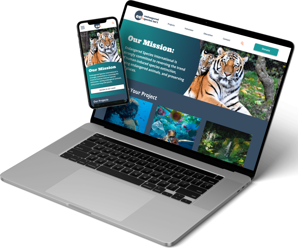
Featuring a mobile-first responsive web design (RWD), updated & contemporary navigation, & a reorganized information architecture.

Featuring a mobile-first responsive web design (RWD), updated & contemporary navigation, & a reorganized information architecture.
Endangered Species International (ESI) is an international non-profit organization that focuses on assisting and creating awareness for the most at-risk species worldwide, with a special emphasis on African native species.
Primary Goals: Typical for a non-profit, ESI heavily relies on donations and volunteers, and having an intuitive and attractive website is a crucial aspect for the organization’s longevity.
*This was a group project created in the University of Irvine’s UX/UI Educational Program, and no one from ESI ever responded to attempts to contact.
Figma
Adobe Illastrator
Google Froms / Drive
Miro
Behance
Objective: to choose a non-profit in need of website redesign. For ESI, the website must be updated to modern internet standards and the essential processes must be streamlined.
Method: conducting usability testing in the initial stages of brainstorming, restructuring information architecture, making core stylistic changes, and finishing with a final round of usability testing for the redesigned prototype
Results: the hierarchy of information and navigation were reorganized & reconstructed, while the site also received new responsive breakpoints with corresponding designs.
Overall, the redesign improved the intuitiveness and usability of the site, increased appearances of credibility and trustworthiness, and implemented an efficient responsive web design.
In the initial evaluation of the original site, several positive and negative aspects became apparent. The following summarizes the good and the bad characteristics outlined in the heuristic evaluation—
Our first round of usability testing was done on the original site to determine what users thought of the pre-existing navigation and information architecture and how we could reorganize the pages of Endangered Species International’s site map to better support a seamless flow from when the user begins on the landing page to reaching the goal of visiting the site.
Task: Participants were asked to complete three objectives—
Outcomes: participants were
Upon initial analysis of the usability testing results, it is apparent that participants were not only deterred by the outdated style of the website but also confused by its structure.
To further examine and diagnose the shared pain points of participants, the data collection was input into an affinity diagram. It was a consistent focus of participants throughout the various aspects of the site that there was a diminished sense of credibility and trustworthiness, which is not ideal for a non-profit organization operating solely on donations of the public.
Problem Statement: Endangered Species International’s (ESI) current website seeks to embolden the plight of the world’s endangered species, educate the public on the severity of the issue, and garner the support needed to alleviate species extinction, yet their online presence does not meet the modern web standards to achieve the site’s goals.
How might we increase user trust and improve usability for ESI?
User Insight Statement: Visitors to the non-profit organization’s website need a simpler and easier way to donate to specific causes and inquire about volunteer opportunities, as the site’s current user interface is challenging to navigate and deters users who want to support the organization from getting involved.
Once the main problems with the original site were identified and the essential processes and general user paths were worked out, the site map was revised to highlight important features of the organization and streamline the information architecture.
This was done by changing the names and slightly modifying the level one pages, such as “Support Us” became “Donate” and “Endangered Species” became “Education.” Level two pages were simplified and ordered to be intuitive for the user.
The purpose of the secondary round of usability testing was to assess the efficiency of the navigation redesign and RWD elements, with the ultimate goal of uncovering any further impediments hindering users from having comprehensive and seamless usability of the new interface.
Task:
Outcomes: users were
Usability testing round 2 revealed that the reworked user interface and information architecture enhanced the site’s efficacy. Navigating the site to complete each objective was significantly more intuitive for participants, and their recommended changes and critical input pertained predominantly to stylistic choices rather than structural and foundational ones.
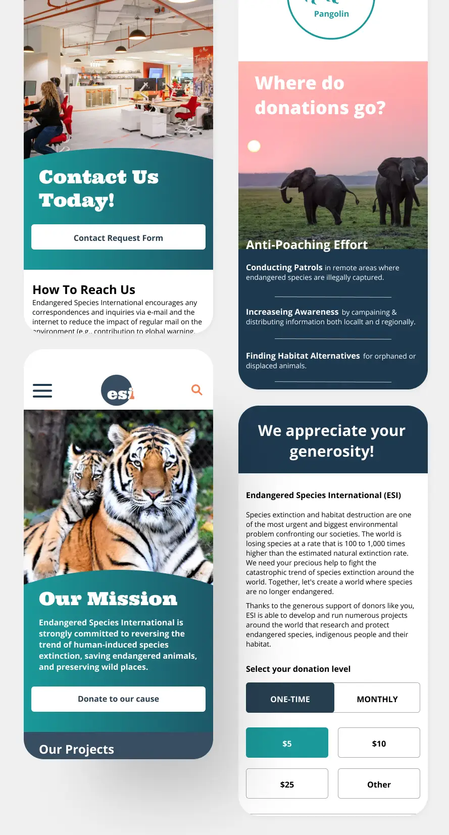
The final iteration of the mobile-first, responsive ESI prototype included ample information regarding volunteer projects, the organization’s mission and real-world efforts, as well as where donations go. The updated interface gives the site a modern look and increases a sense of trustworthiness for users wanting to join the cause.
