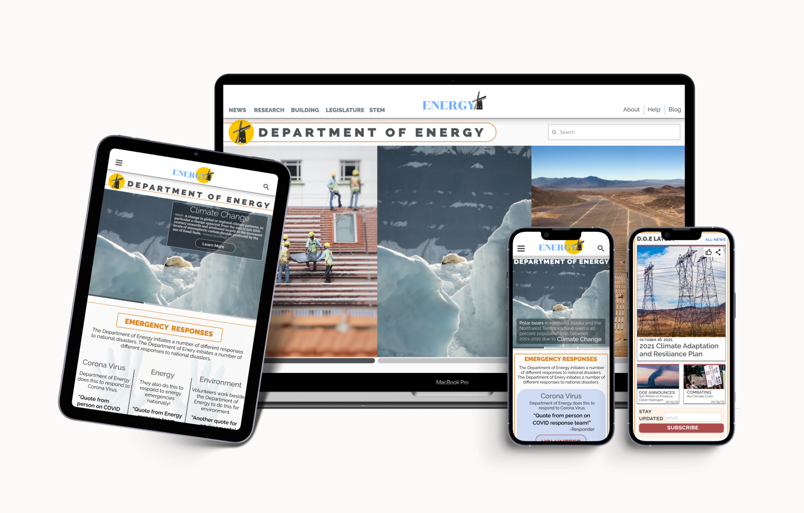
Featuring a mobile-first responsive web design (RWD), updated & contemporary navigation, & a reorganized information architecture.
About
Department of Energy (DOE): an agency of the US Government that acts to ensure the conservation of energy & environment within national boundaries.
DOE’s primary goals: to increase energy efficiency, mitigate the effects of climate change, and develop and enforce regulations based on novel research findings related to these objectives.
*This was a group project created in the University of Irvine’s UX/UI Educational Program and has no affiliation with the Department of Energy.
Tools
Figma
Adobe XD
Google Froms / Drive
Balsamiq
InVision
Miro
Project
Objective: to solve fundamental usability issues presented on the Department of Energy (DOE) website & mobile application.
Method: usability testing—users were observed using the site, both before and after redesign.
Results: the hierarchy of information and navigation were reorganized & reconstructed, while the site also received new responsive breakpoints with corresponding designs.
Overall, the redesign was observed to be successful in enhancing user experience.
1. Evaluating the Problem
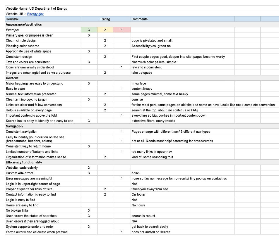
Heuristic Evaluation
Before starting the testing and redesigning process, a heuristic evaluation was conducted on the DOE site to make an informed methodology for producing the best, most user-friendly outcome. Upon evaluation, the site in its original state was considered to have several practical aspects, but also features various factors inhibiting usability and intuitive operation.
Positives: easily accessible search with intelligible filter options; clear & concise page titles, headings are emboldened & well-defined
Negatives: highly unorganized & unclear information architecture, not apparent/hidden essential site elements, & inconsistent UI from page to page
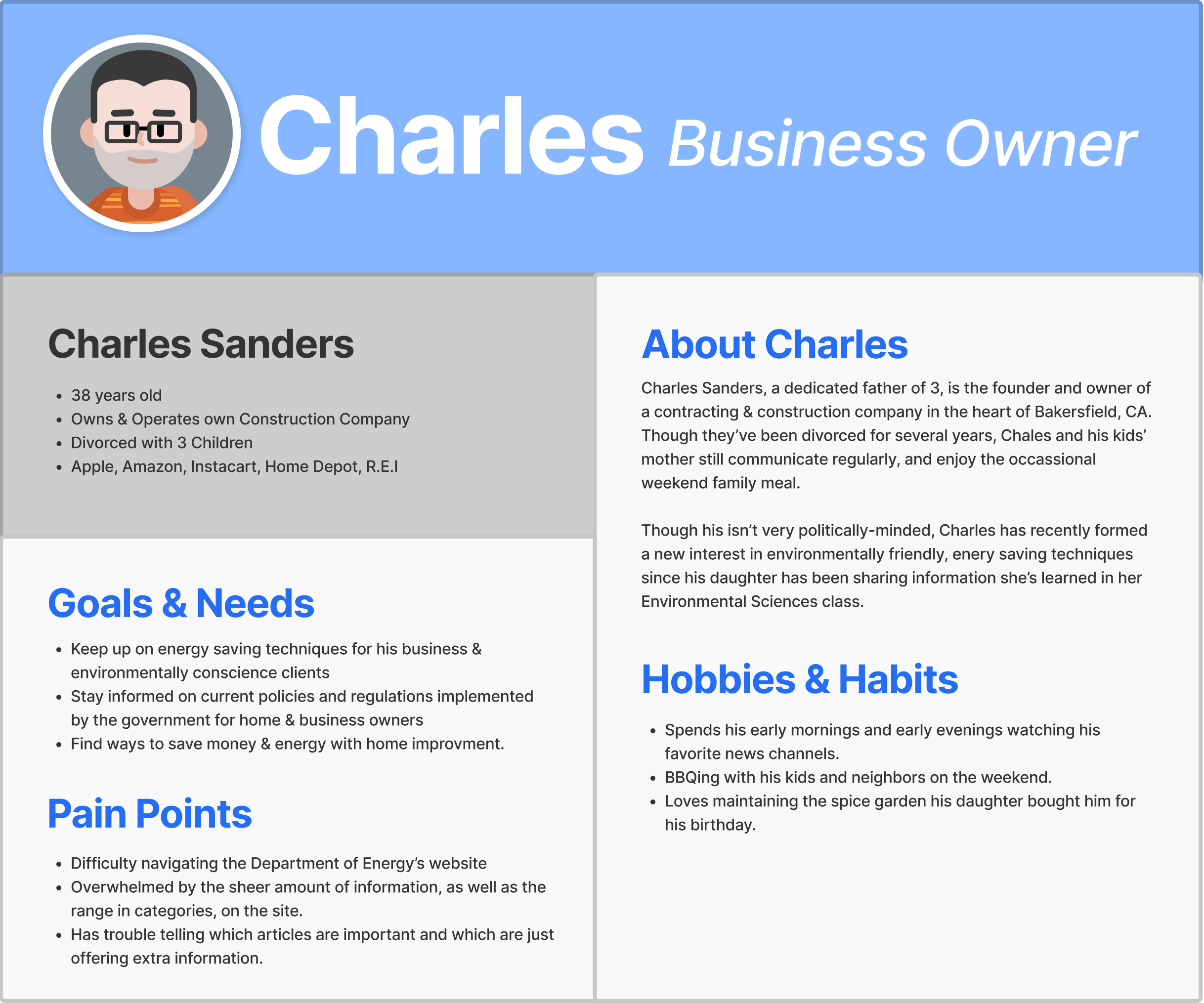
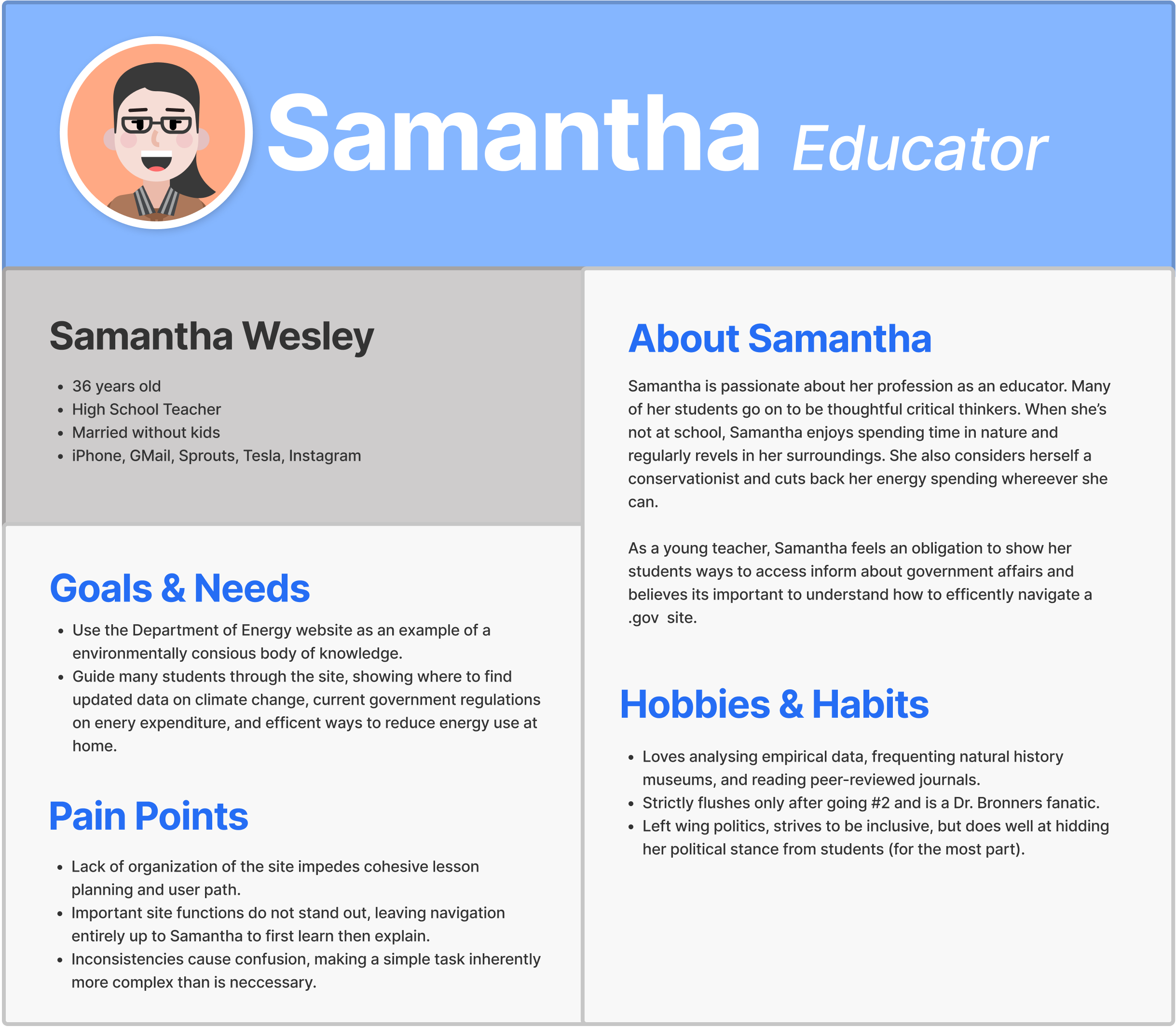
Proto-Personas
To begin the redesign process, it was decided to conduct usability testing immediately after an initial evaluation to identify the features that should be retained, improved, or eliminated. Participants were asked to complete three objectives that were derived from quickly compiled profiles of likely users featured in the above proto-personas. During testing, participants were asked to verbally communicate their thoughts aloud while we monitored the number of steps and time each task took to complete.
Usability Testing I
To begin the redesign process, it was decided to conduct usability testing immediately after an initial evaluation to identify the features that should be retained, improved, or eliminated. Participants were asked to complete three objectives that were derived from quickly compiled profiles of likely users featured in the above proto-personas. During testing, participants were asked to verbally communicate their thoughts aloud while we monitored the number of steps and time each task took to complete.
Task: Participants were asked to complete three objectives—
Find information/webpage on climate change
Locate reports on effects specific to your region
Find a page/article on energy-saving appliances,
Locate the how-to manual on reading an EnergyGuide Label
Find information regarding weatherization and the Intergovernmental Projects Office
Locate your state’s energy efficiency and renewable energy projects
Locate your state’s Weatherization Assistance Program application
Outcomes: participants were
Overwhelmed by the abundant content & tiny text
Unable to figure out their location on the site (i.e., no breadcrumbs)
Lost upon leaving the homepage due to the lack of sensical information hierarchy
Not able to access on mobile devices
Average time of completion: 6.92 minutes
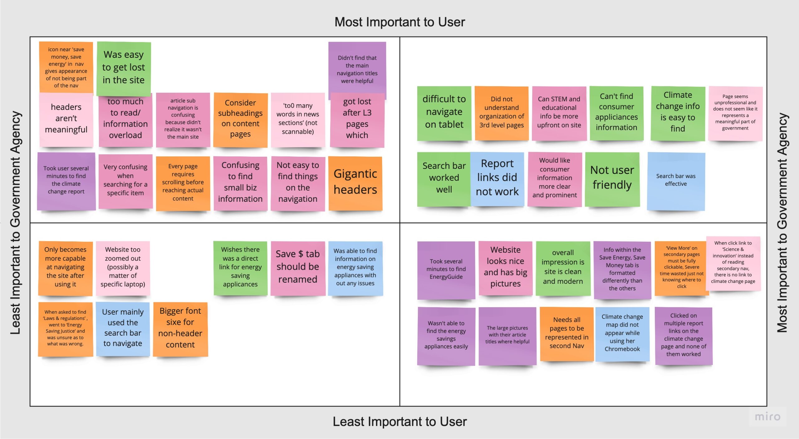
Following user testing and data analysis, it was determined that the information architecture was a significant impediment to participants promptly finding relevant information on the site. A user persona was created, and priority attention was given to reformatting the site map and primary navigation, as these elements caused the most confusion during user navigation.
Above: Feature prioritization matrix of usability testing results.
The Problem
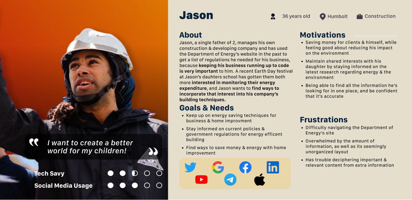
After gaining a deeper understanding of the issues users face while navigating energy.gov through usability testing, we identified key pain points which, combined with the personality traits, desires, & motivations formulated in our proto-persona, a problem statement was constructed to guid our redesign. Additionally, a user persona (below) was created to represent a potential user who might occasionally access the DOE website.
Problem Statement: DOE’s website was created to inform the public about the agency’s internal research and policy regarding energy and the environment. We have observed that the DOE website is non-self-explanatory and lacks ease of use, causing users to abandon the site & seek information elsewhere.
How might we improve site cohesiveness & usability for the Department of Energy?
User Insight Statement: Online users who may be interested in conservation, construction, government policy, science, or just browsing, need a clear, effective way to navigate the Department of Energy’s website.
Currently, the site’s confusing hierarchy of information, inconsistent user interface, & non-responsive web design (missing mobile breakpoint) deters people of any technology skill level from using the valuable resources and information hidden within the site.
2. Information Architechture
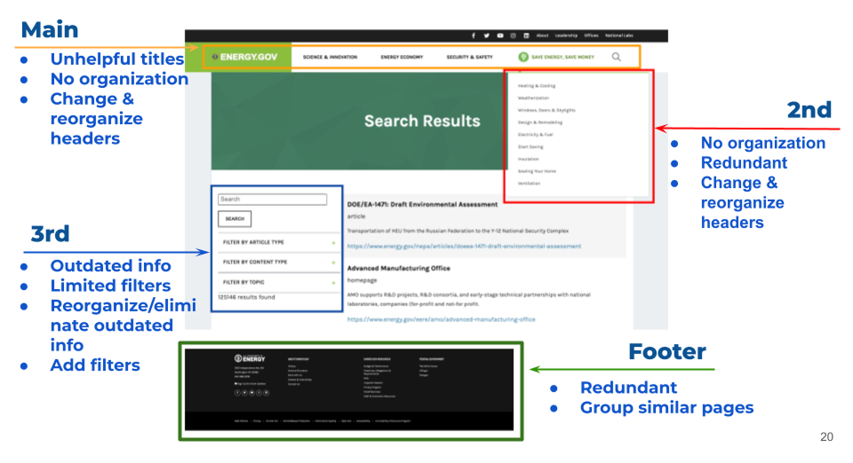
Original Navigation Issues
To begin the redesign process, it was decided to jump straight into usability testing after an initial evaluation to shed light on the features that should be kept, improved, or scrapped.
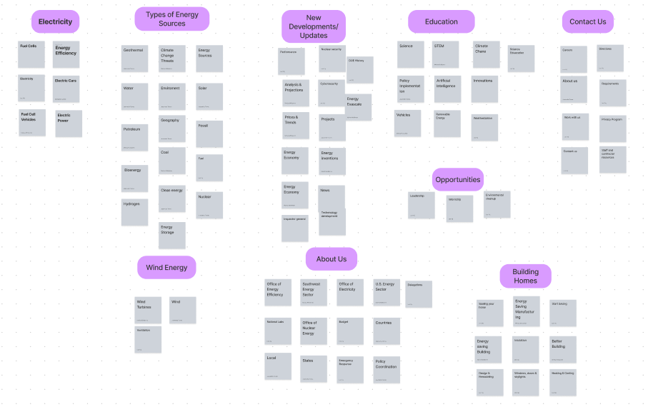
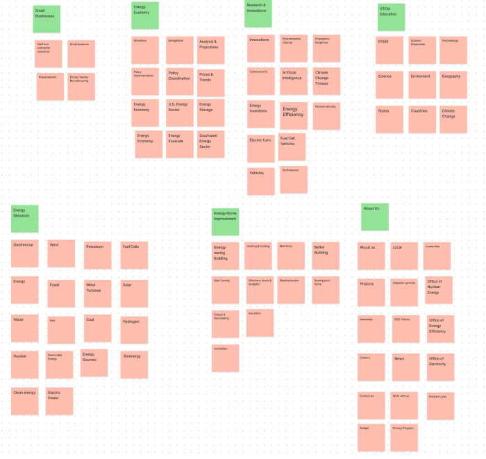
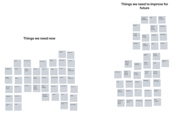
Card Sorting
New participants were asked to organize a sample of thirty 3rd-level pages into their categories created by the individual. Groupings that were most commonly suggested by the user were:
Energy: including cards such as fossil fuels, wind power, and clean energy
Home Improvement: including cards such as energy saving and saving with appliances
Education & Opportunities: i.e., STEM and Volunteering
Science & New Developments: i.e., Projects, News, and Analysis & Projections
About Us: including About Us, Contact Us, and Job Opportunities
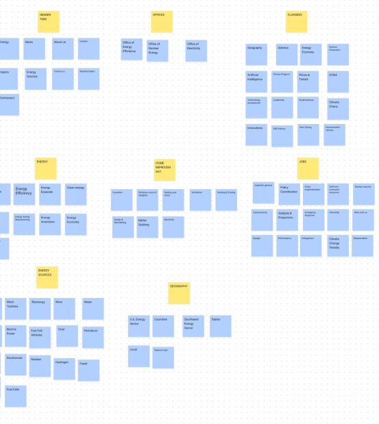
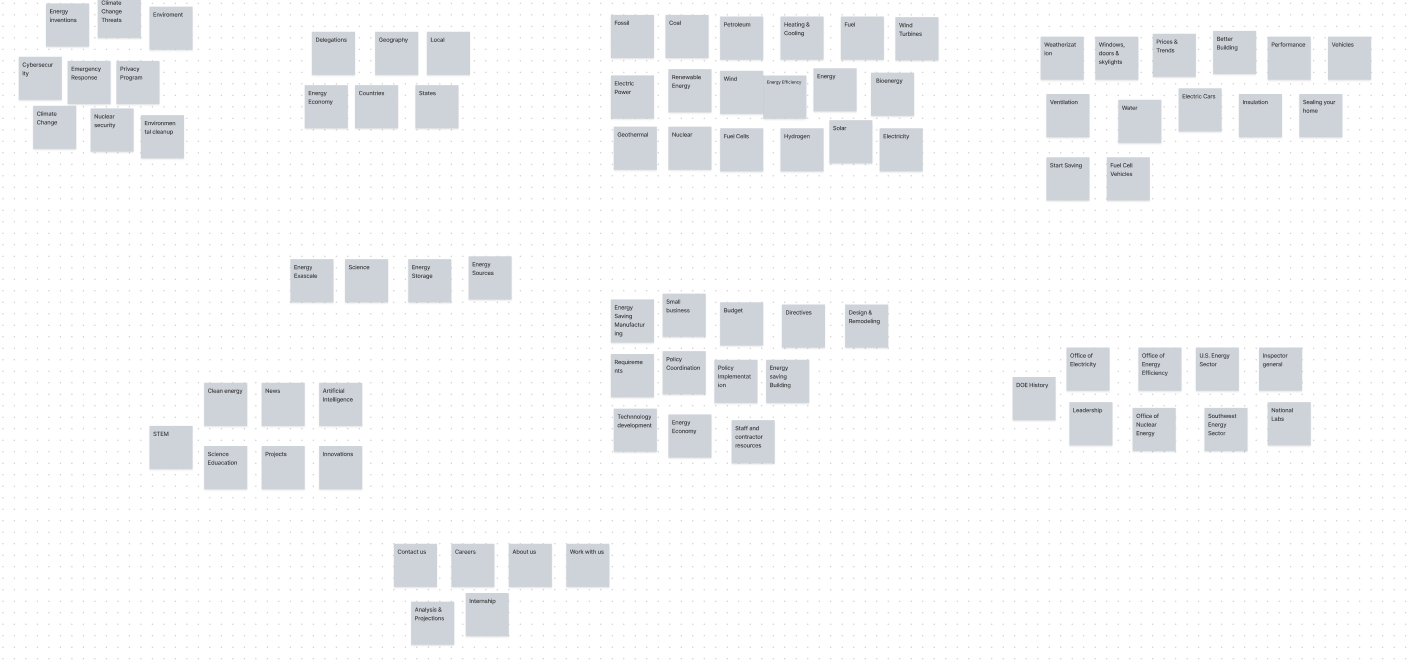
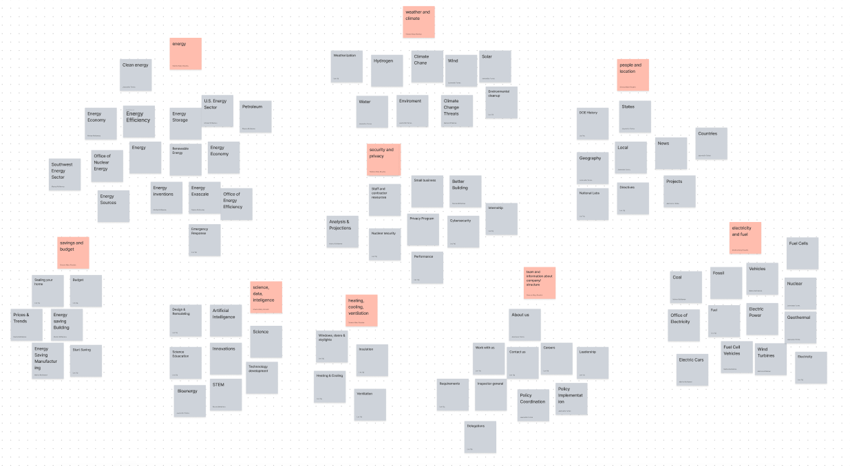
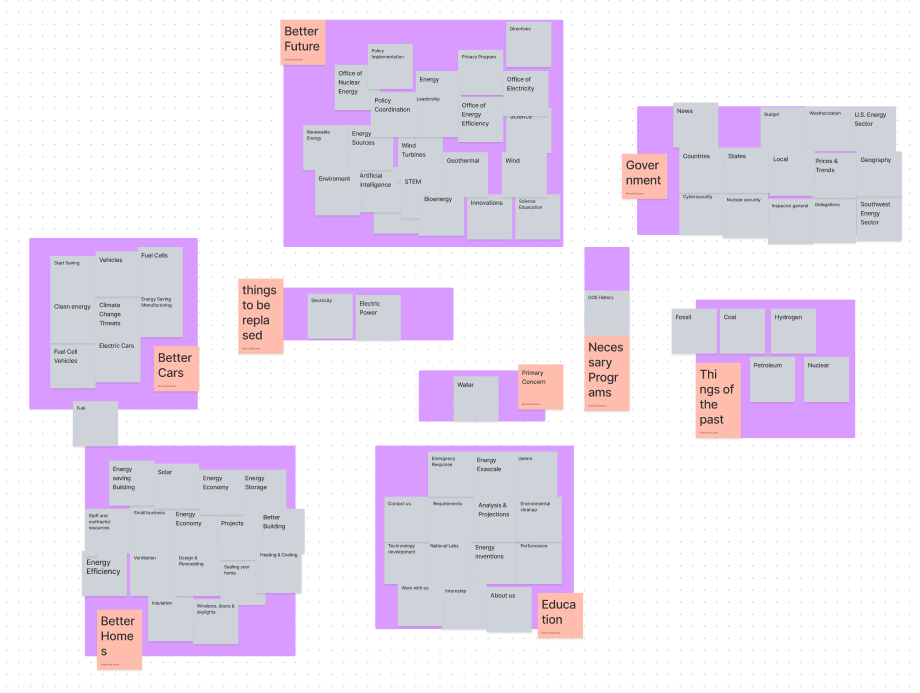
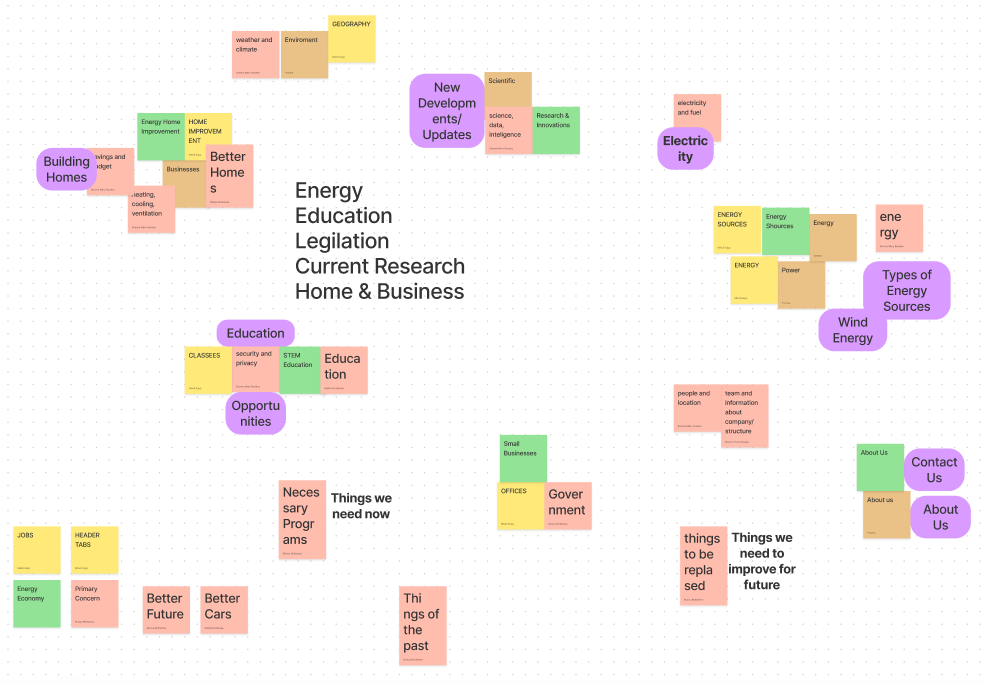
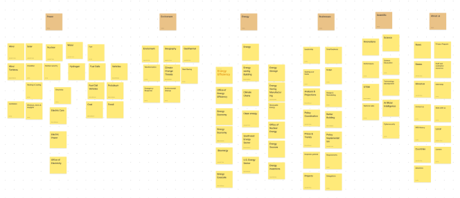
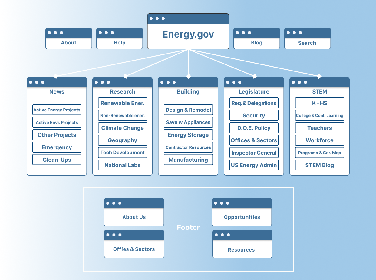
Revised Site Map
Using data from the card sorting, a new site map was constructed implementing a generalized version of the categories suggested by the participants. Each category is intended to cater to the most likely users of DOE’s site, such as the climate concious, students & teachers, home renovators, and business owners.
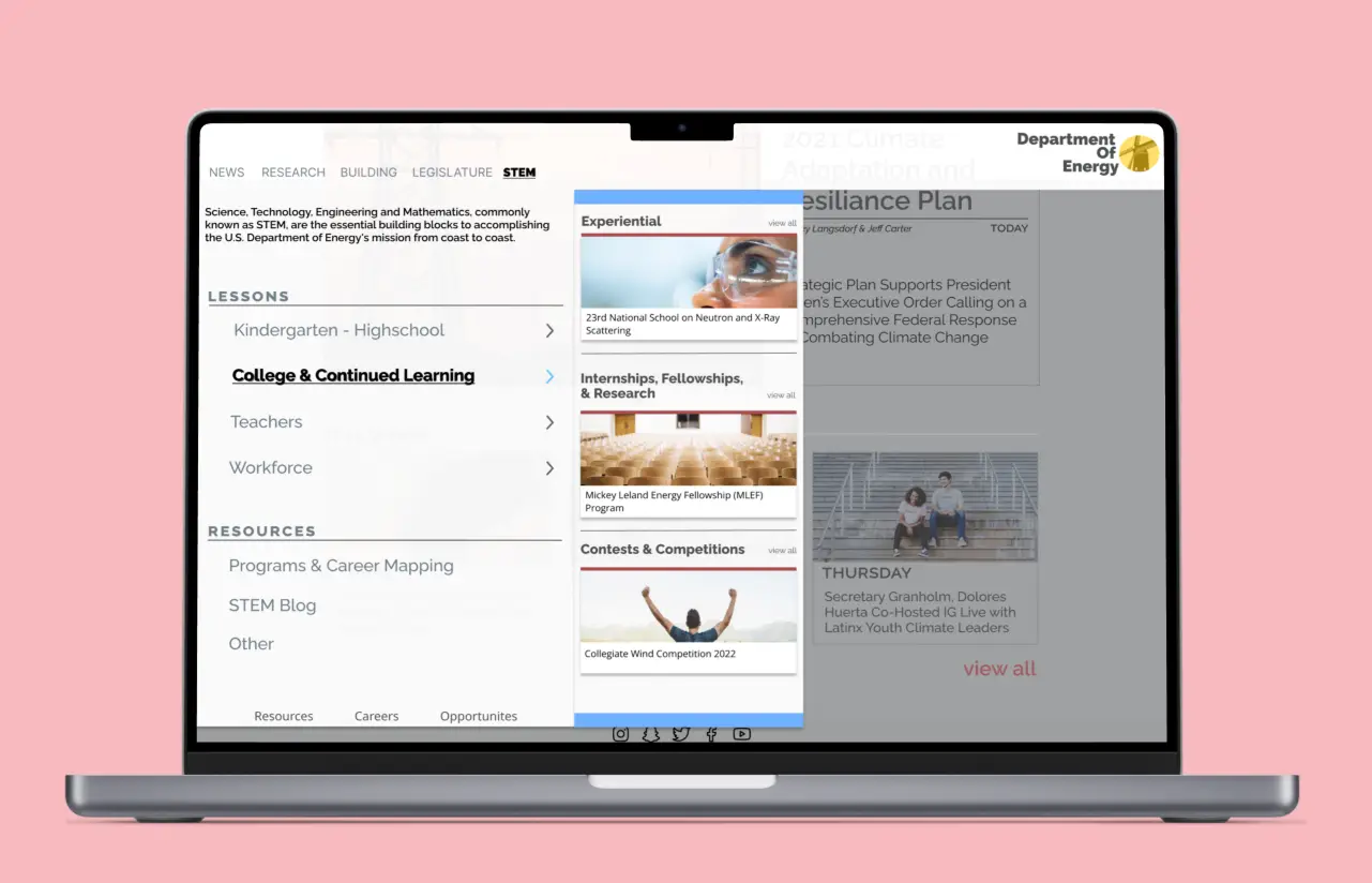
3. A New User Interface
Beginning Navigation & Lo-Fi Mock-Up
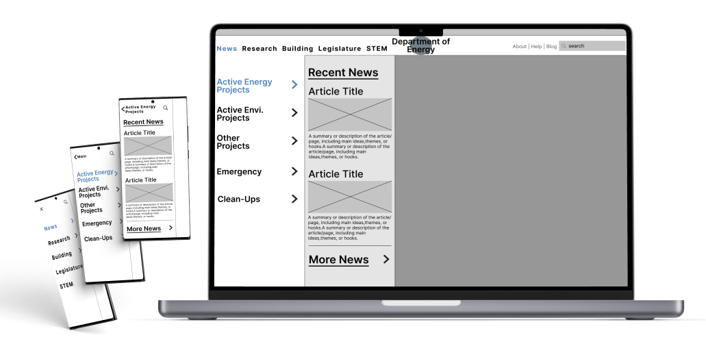
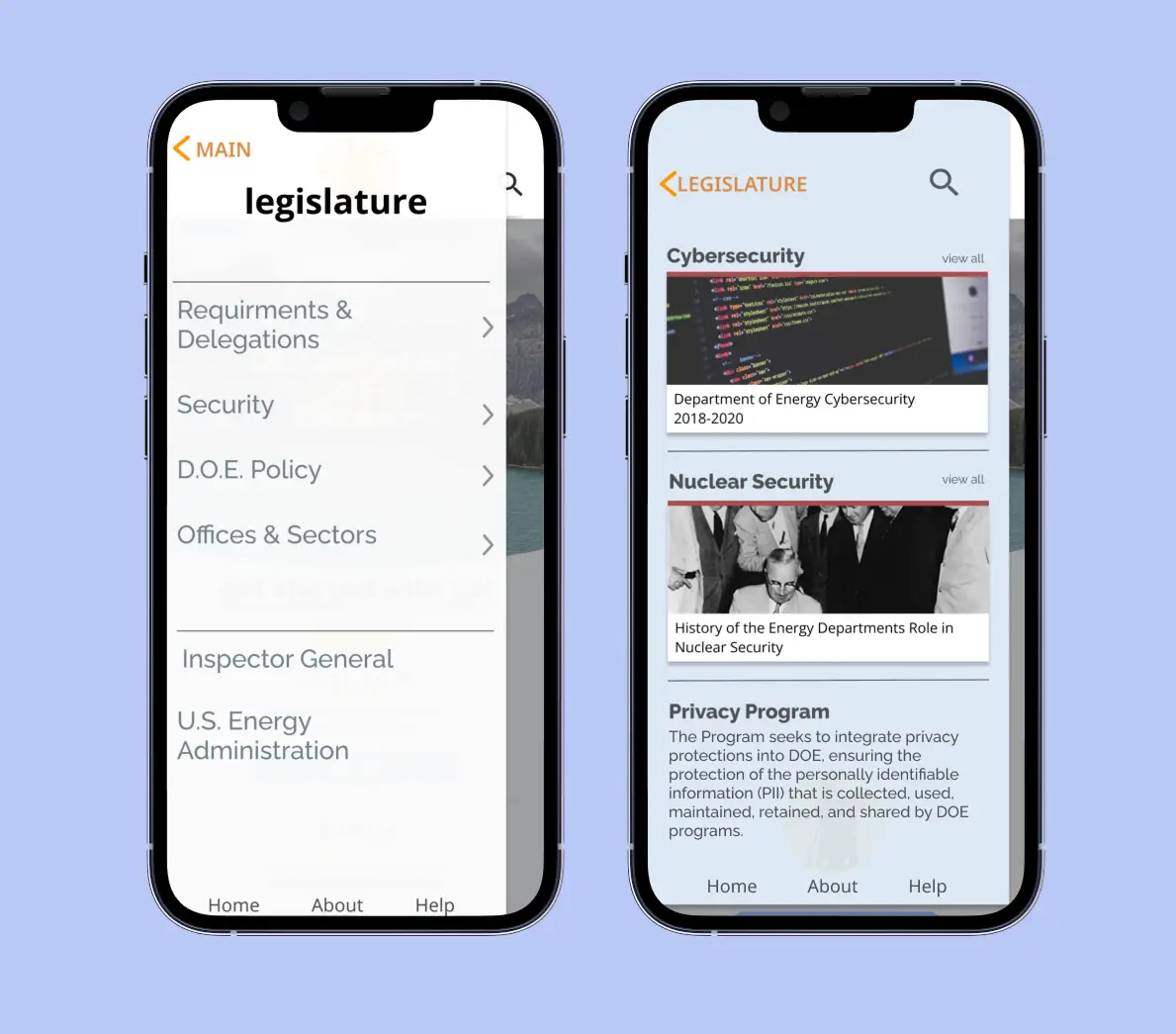
In creating a new primary navigation
Pages were organized into a primary navigation system composed of 3 levels
Constructed as an alternative to a mega nav, as this method may be easier for new users to browse content they are unfamiliar with
Because of the sheer amount of content & pages on the site, giving the user a method of browsing 3rd level pages through the navigation limits confusion & the need for a secondary navigation
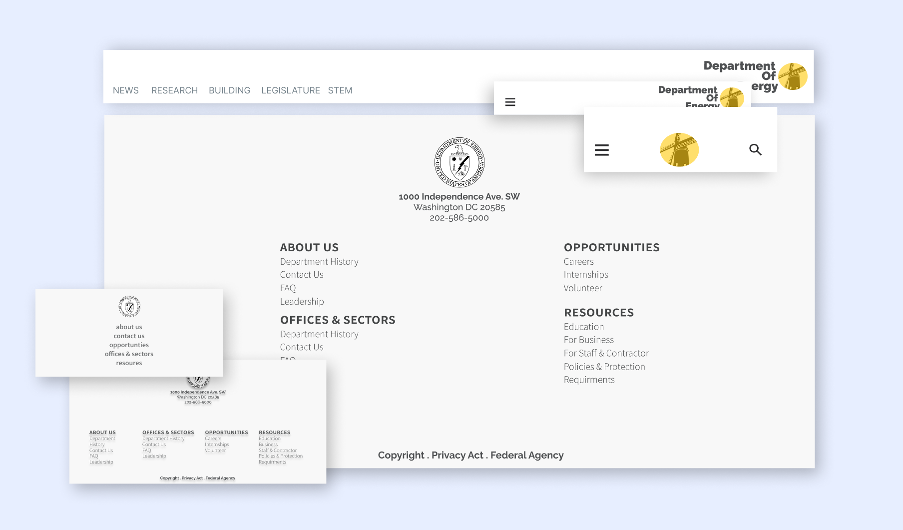
Responsive Header & Footer
UI Style Guide
4. Mid - Hi Fi Prototyping
Initial Mid Fi RWD Design
Using data from the card sorting, a new site map was constructed implementing a generalized version of the categories suggested by the participants. Each category is intended to cater to the most likely users of DOE’s site, such as the climate concious, students & teachers, home renovators, and business owners.
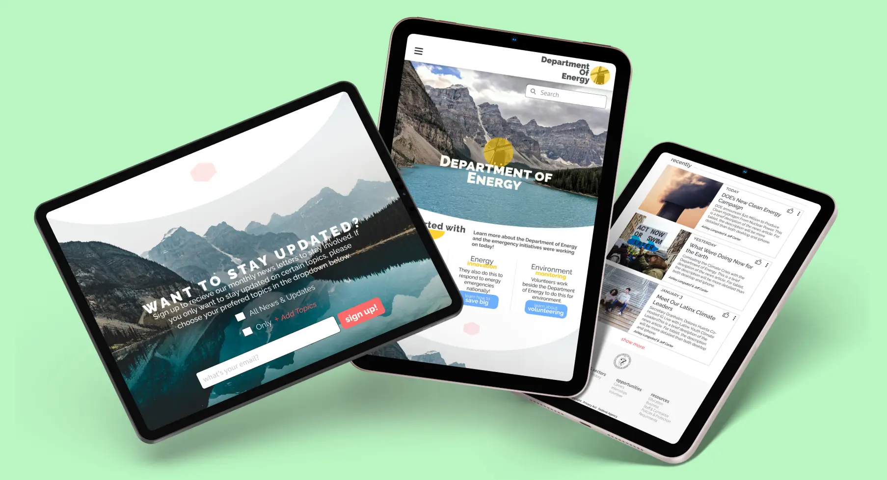
Iterated Responsive Prototype
Usability Testing II
The purpose of the secondary round of usability testing was to assess the efficiency of the navigation redesign and RWD elements, with the ultimate goal of uncovering any further impediments hindering users from having comprehensive and seamless usability of the new interface.
Task:
Find information regarding climate change
Find career and volunteer opportunities
Use the site’s navigation to seek online learning resources for adults & workers
Outcomes: users were
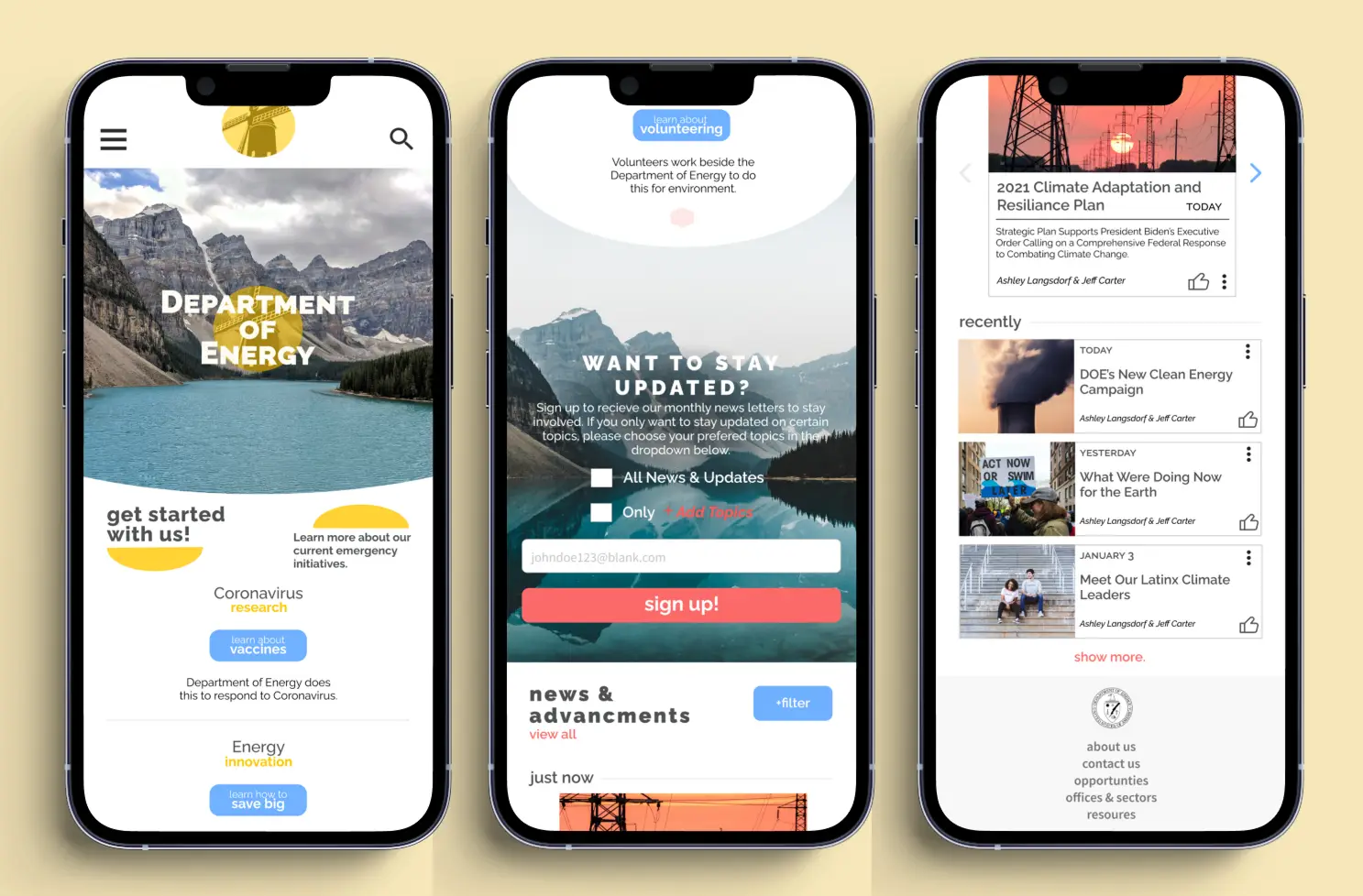
Resize the hero image to take up less of the screen before scrolling
Adjust the emergency response volunteer section on the landing page to imply informational reading rather than an advertisement (i.e., remove quotes of personnel) and personalize buttons for each volunteer opportunity
Clarify abbreviations, highlight the email sign-up form
Adjust the footer font color to add more contrast for accessibility
Average timeof completion: Desktop 1.17 minutes, Mobile 1.54 minutes
Usability testing round 2 revealed that the reworked user interface and information architecture enhanced the site’s efficacy. Navigating the site to complete each objective was significantly more intuitive for participants, and their recommended changes and critical input pertained predominantly to stylistic choices rather than structural and foundational ones.
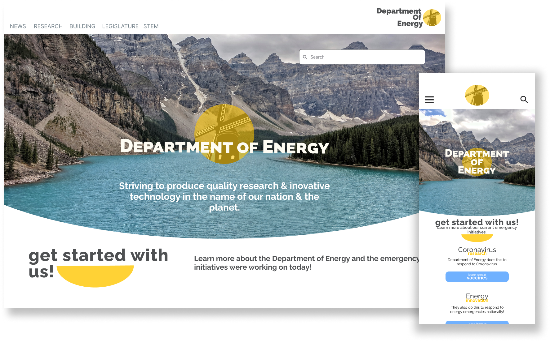
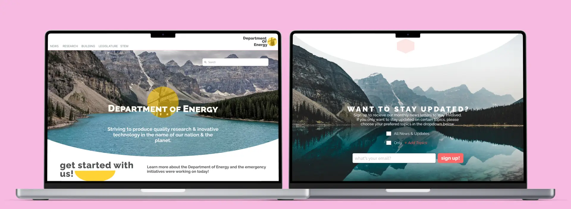
Final Prototype
After addressing issues found in user testing, the design was further simplified and iterated. This consisted of changing the hero image and formatting, highlighting the email sign-up process, and modifying headers & footers.
