2021
App Design:
Night Out
A mobile app concept that makes finding & planning events during the pandemic easier for those who prioritize COVID safety regulations, as well as those who don’t.
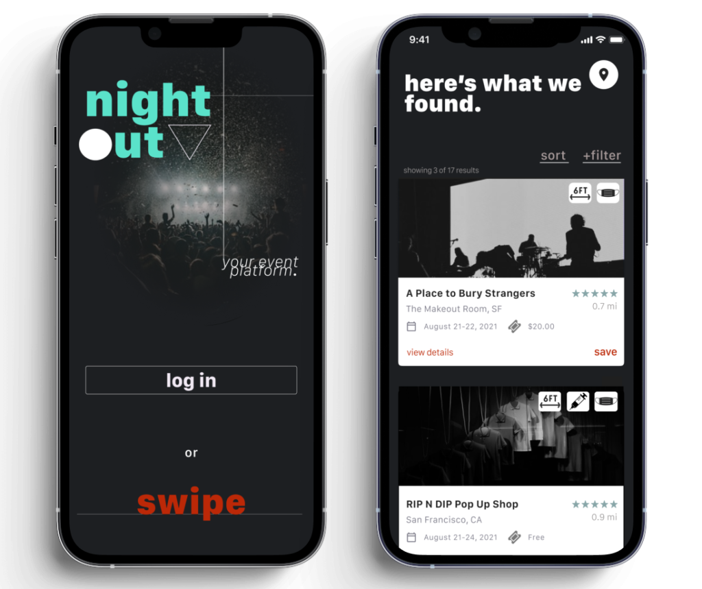
A mobile app concept that makes finding & planning events during the pandemic easier for those who prioritize COVID safety regulations, as well as those who don’t.

Night Out is a mobile event finder that enables users to easily discover nearby events—ranging from big events hosted by promoters to intimate gatherings held by local individuals. Users can quickly determine and even filter an event’s implementation of COVID safety precautions practiced.
Other prominent features of Night Out include the ability to create private events and send invitations to guests, connect to social media accounts to view what events friends are RSVPing to, and receive recommendations for local concerts by linking to music apps (such as Spotify and Apple Music).
*This was a project created in the University of Irvine’s UX/UI Educational program and is only a prototype.
Figma/Figjam
Excell
Google Forms/Drive
Miro
Objective: Develop a mobile app that assists travelers in planning various aspects of their trip, with a focus on navigating the post-COVID landscape. Then, design the onboarding process and landing page.
Methods: The creation of the app was informed by a series of user interviews and competitor analysis. Subsequently, the app’s efficacy was evaluated through usability testing.
Results: Night Out was created to address the issue of a lack of a centralized, easy-to-use event finding/hosting platform, as identified through user interviews. The app also simplifies identifying events adhering to COVID safety precautions.
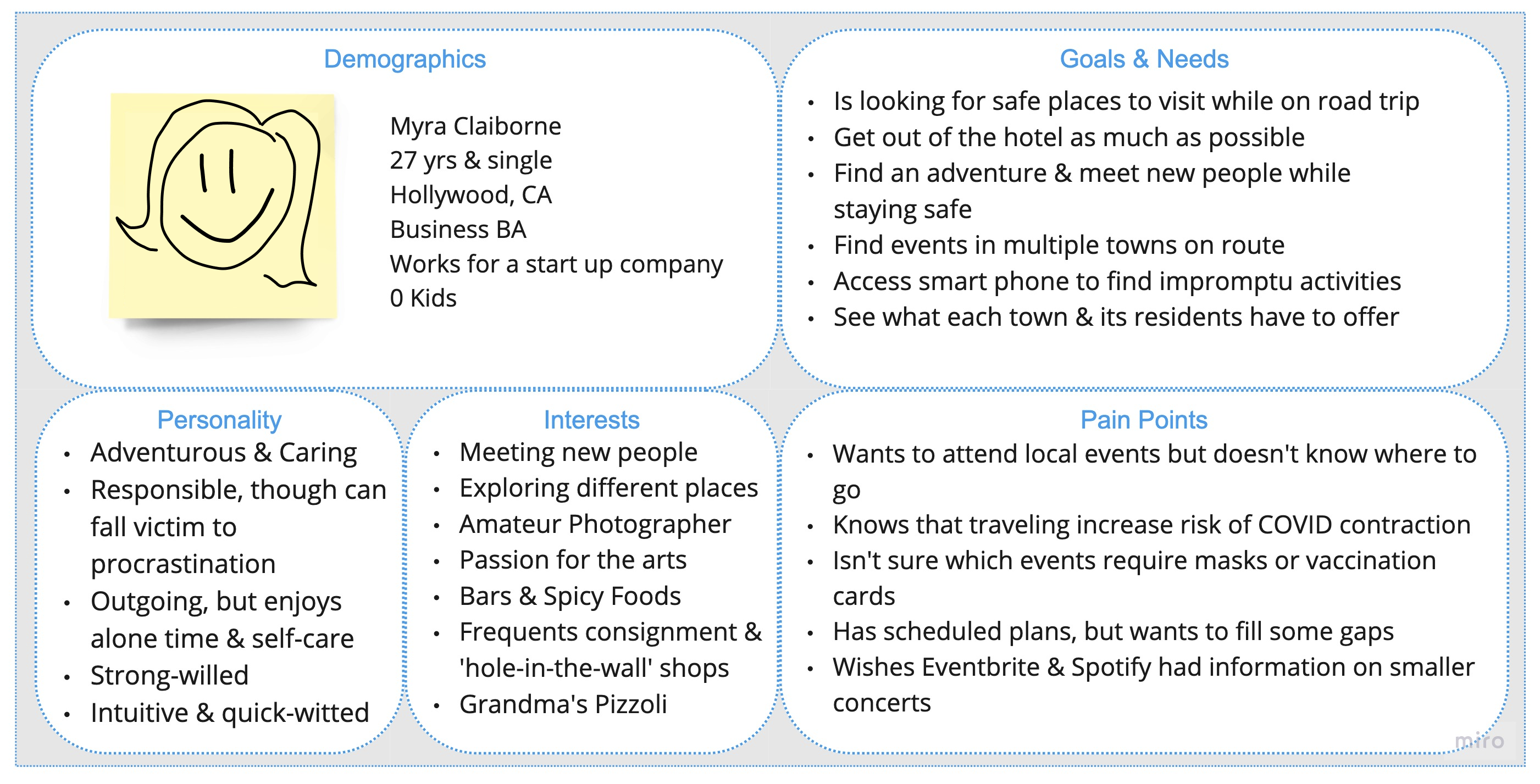
A proto-persona was drafted to initiate the user research process, define probable user characteristics, and begin workshoping the needs and existing problems to be addressed with the app.
Before commencing app ideation, it was imperative to gather data from potential users/participants to operationalize real-world thinking into actionable insights that would inform the app’s construction. It was decided that user interviews would be conducted, followed by the dissemination of an online survey; this would allow the focal points discovered in user interviews to be further tested among a larger audience through an online survey.
Objective: The specific focus of the user interview research plan revolved around 3 objectives
*Due to the constraints of this class project, the subject sample is considerably small (n = 5) and should not be considered an accurate representation of the general population.
Method: In-person and virtual user interviews (n = 5), as well as an anonymous online survey created using Google Forms (n = 22).
Interview Results: Each interviewee expressed numerous frustrations with the apps currently available for planning and searching for events. Many were concerned about being informed of an event’s safety standards before attending and felt it was vital that the venue or event hosts enforce them.
It was also found that, when in search for a non-specific event—
"I feel like I'm taking a risk every time I go to [an event] without knowing how the venue handles COVID safety. Safety is very important to me"
User #5
"It's difficult finding things when you don't know where to look. I'll use google but it's difficult because it's extremely expansive."
User #3
"I look for events that are age-appropriate, that the whole family will like, also no big cost, and it's nearby...It has to be really easy or I won't go."
User #2
Survey Results: Of individuals who sought events while on a trip or vacation:
After transcribing the user interviews, participants’ responses were summarized into user research insights and finally organized into an affinity diagram, grouping the results of the interviews into 9 categories highlighting where and what participants had recently attended, information and planning around COVID safety practices, and major pain point with events and event apps.
Finally, all of the above user research methods were synthesized into the user persona below.
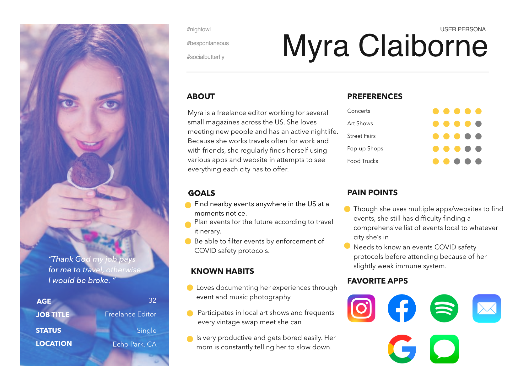
User Insight Statement: Because competitive apps and event ticket sites fail to gather a comprehensive list of events and local happenings, Myra needs an easy, innovative way to search for upcoming, safe events that align with her specified interests and are located along her travel route or near her current location.
Providing a platform that features details about local events and their venue’s COVID safety regulations will allow Myra to plan her evenings out enjoyably, efficiently, and with peace of mind.
Problem Statement: NightOut is designed to facilitate the flow of information from event-thrower to event-goer and to aid the event-goer in their search for interest-specific, safe events.
We have observed that travelers experience an amplified inability to search in and select from a comprehensive database of events local to their destination due to: a lack of access to the normal, oral circulation of event information one would usually receive from a social circle; and lack of access to any single tool that efficiates the planning for a holistic range of organized activities.
How might we help the average traveler enhance their success at experiencing the overall local milieu of a destination, while operationalizing such a measurement by recording ticket sales, app traffic, and feedback of positive reviews?
How might we improve site cohesiveness & usability for the Department of Energy?
Positive and negative aspects to each analyzed competitor can be viewed in the full analysis document; however, some prominent strengths and weaknesses were:
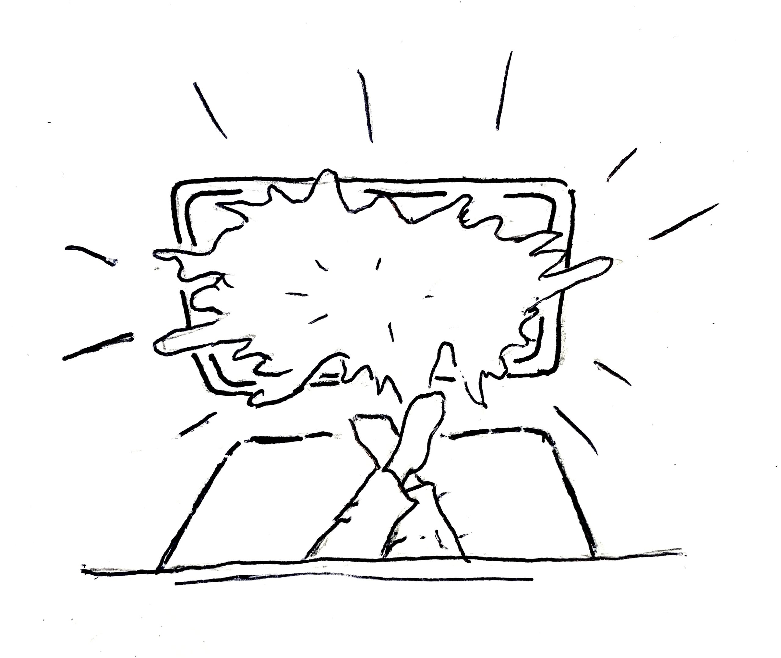
Myra is away on business. Her late-afternoon meeting got canceled that evening, leaving her with a large chunk of time to fill before her flight the next day.
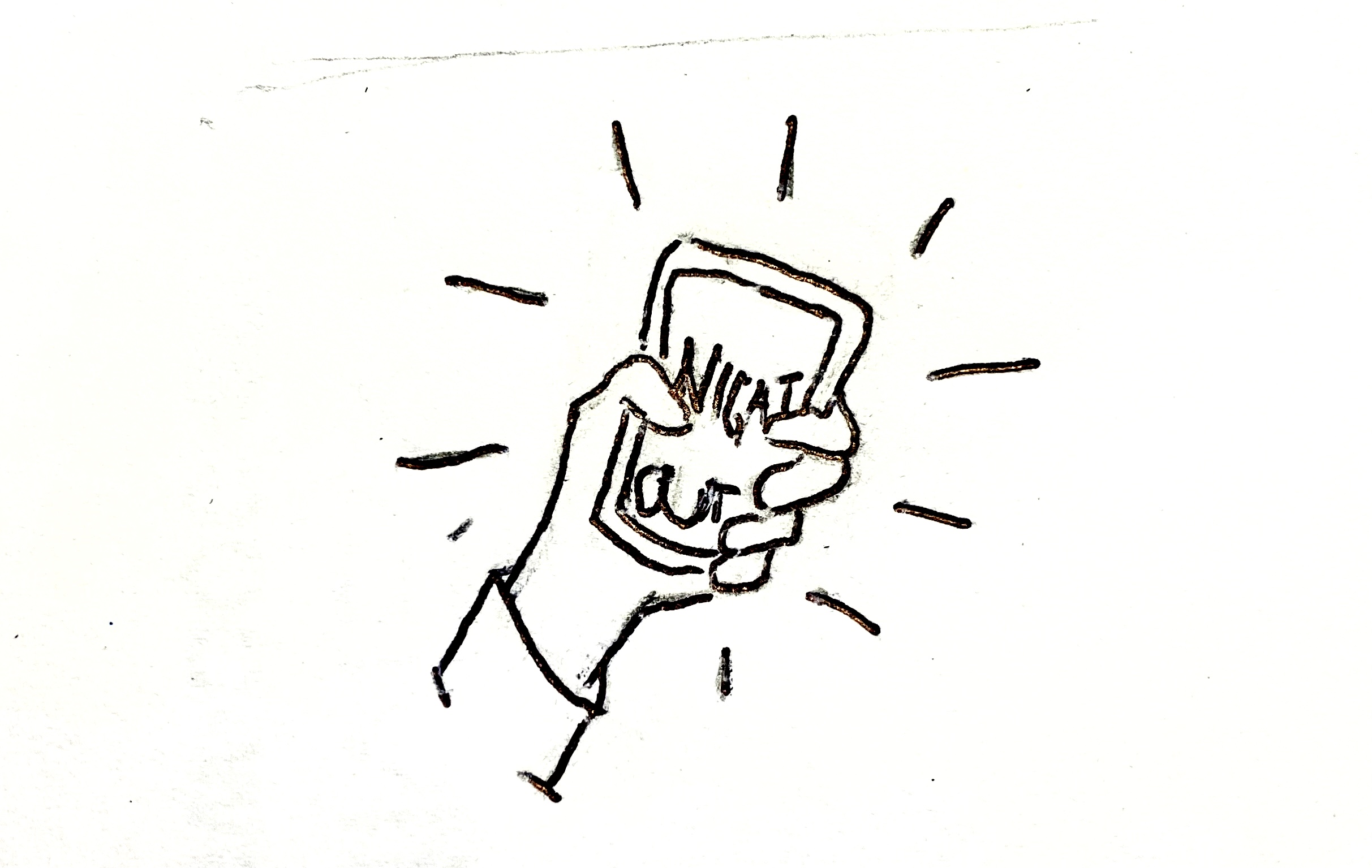
Not wanting to sit in her hotel room alone all night and being the social butterfly that she is, Myra pulls out her phone and brings up her NightOut app.
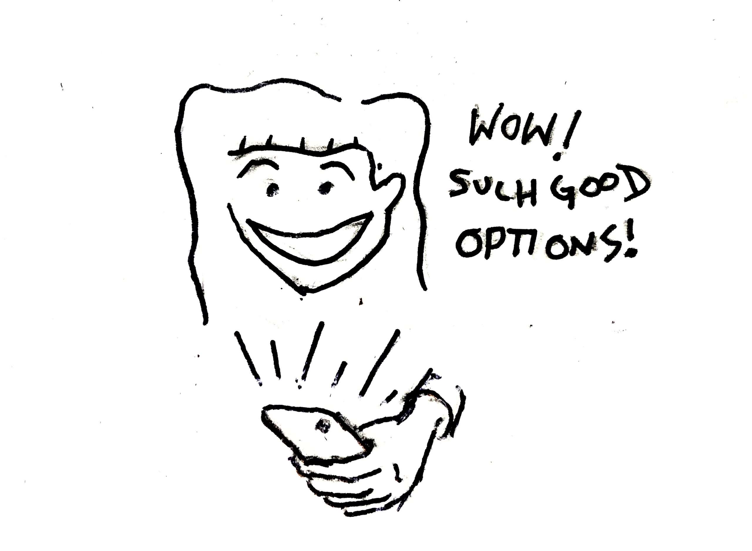
Myra isn’t quite sure what she wants to do, but she knows she to stay close and stay (COVID) safe, so she leaves the search bar blank and sets the filters for within 4mi and masks or vaccination required.
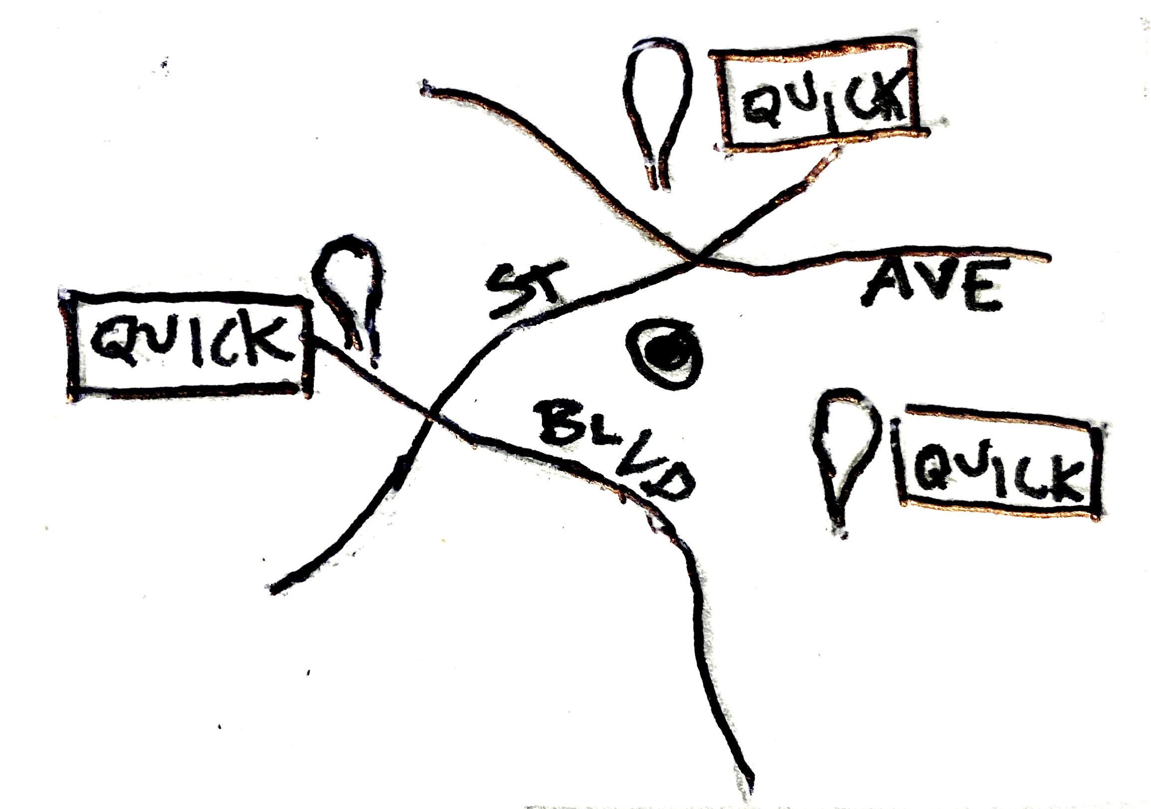
What a surprise! A ton of events are happening nearby and starting soon! After reading through their descriptions, she chooses a concert featuring a band she loves that just happens to be local to the area. She instantly buys her ticket from the app with apple pay.
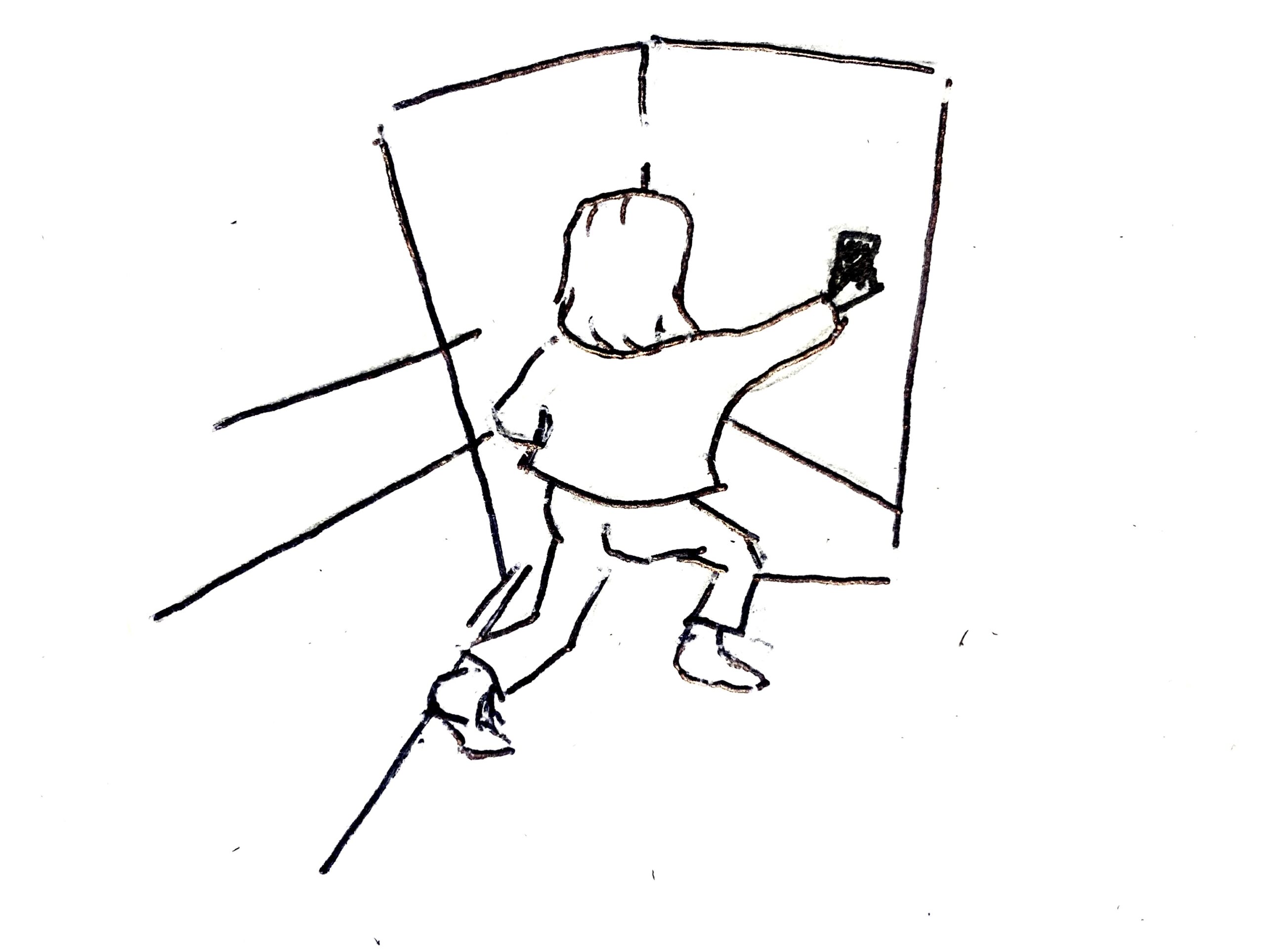
Rejuvenated with newfound excitement, Myra quickly shares the event to her co-worker group chat for anyone else looking for something fun in town, taps ‘Open in Maps’, and is on her way. For the bands she doesn’t know, she finds links on the event page to their Spotify pages and listens to them on the go through headphones.
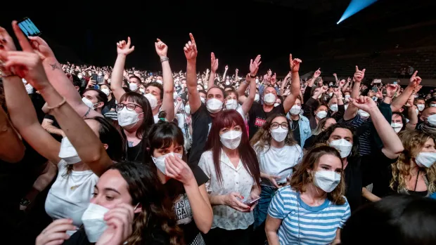
After receiving the link in the group chat, all of Myra’s coworkers also downloaded Night Out. The next day, Myra RSVPs to a dinner party her coworker invited her to through the apps create an event feature.
The user flow diagram illustrates the primary paths users take when using the app. It outlines the four main processes they can engage in:
click image above to enlarge and zoom in.
The purpose of usability testing was to evaluate the main functions of the app (searching, creating events, and adding trips) for ease of use, ensuring they’re self-explanatory. Additionally, the bottom navigation was tested to determine if users can distinguish between each option and if the options make logistical sense. Main questions: is the prototype easy to use, and are the filter options helpful or excessive?
Tasks:
Outcome: Users were—
Layout: not all clickable buttons are consistently placed throughout (save/post/new should all be in similar places)
Flow: Establish alternative navigation to bottom nav by inserting clickable buttons to main pages on the front search page/homepage
Features: Include 1-2 coaching pages before onboarding to inform users about key app functions.
Overall, the resulting participants’ responses outlined above were considered critical and were implemented into the prototype.
Through usability testing insights, the interface style was transitioned to a higher contrast scheme for accessibility purposes. All buttons were replaced with a singular and consistent design. Three coaching pages were added to the sign-up process to inform users of the app’s capabilities and functions. Additionally, navigation buttons were inserted into the landing/search page to enhance ease of movement.
The mock-ups below illustrate the coaching and onboarding process for Night Out, which explains the app’s features and culminates in the landing page that enables users to search for existing events, create their own event page, and plan a trip, displaying events near their destinations.